Neutral palettes have a reputation they don’t really deserve: “boring”, “cold”, “seen everywhere on Instagram”. In reality, a neutral interior can be incredibly warm, enveloping and personal… if you treat it as a project and not as a default setting.
In this article, we’re going to look at how to build a neutral scheme that feels cosy and lived-in, not clinique or showroom-ish. On the menu: where to start, which tones to choose, how to layer textures, where to invest, what you can DIY, and the classic mistakes to avoid.
What do we actually mean by a “neutral palette”?
Let’s align on vocabulary before picking paint.
A neutral palette isn’t “everything in white and beige”. It’s a base built around colours with low saturation and soft contrast:
- Whites (warm, cool, broken)
- Beiges, sands, linens
- Greys (greige, taupe, stone)
- Brown tones (café au lait, caramel, chocolate)
- Soft black / charcoal
What makes it feel warm or cold is not the “neutral” label, but:
- The undertone (yellow/red = warm, blue/green = cool)
- The materials you pair with it (oak vs high-gloss lacquer)
- The light in the room (orientation, size of windows, type of bulbs)
Before you choose anything, stand in your room at three different times of day and observe the light. North-facing rooms and cities with grey winters don’t forgive the same choices as a sun-drenched loft in Marseille.
Start with the envelope: walls, ceilings, floors
If you want a neutral palette that feels intentional, start with the “envelope” of the room. This is what will set the overall temperature.
Walls: pick the right kind of neutral, not just “the one that looked nice on Pinterest”
On a renovation project, we usually test 3–5 neutral paints per room directly on the wall. Not on a tiny swatch. Not on your phone screen.
Work with two axes:
- Warm vs cool: For a welcoming feel, lean warm to slightly warm (yellow, red or pink undertones) rather than cold (blue/green).
- Light vs medium depth: Ultra-light colours are airy but can look flat. A very light greige or linen can feel warmer than a bright gallery white.
Concrete tip: paint A4-sized test patches at eye level on at least two walls, and live with them for 48 hours. Look at them in daylight, at dusk, and with your lamps on.
Budget & effort (walls):
- DIY painting: ~€2–4/m² (paint + basic tools), 1–2 days per room for non-pros.
- Pro painter: ~€20–35/m² in France (surface to paint, not floor area), depending on prep work.
- Don’t cheap out on primer if your walls are patched or previously dark.
Ceilings: not always bright white
A stark pure white ceiling above a warm neutral wall can cut the room in half and create a “boxy” effect.
Three options worth testing:
- Use the same colour as the walls, lightened by 20–30% by your paint supplier.
- Stay with white, but pick a warm white (slight cream/ivory undertone).
- In small rooms, paint walls and ceiling the exact same neutral for a cocoon effect.
Floors: don’t forget the biggest surface in the room
Nothing kills a warm neutral scheme faster than an orange laminate floor or a cold blue-grey tile you haven’t taken into account.
Identify your existing floor tone first:
- Honey / oak / natural: easy to warm up, works with most beiges and greiges.
- Very yellow/orange varnish: balance with more beige and taupe, avoid extra yellow.
- Cool grey tile: add warmth on top (rugs, textiles, wooden furniture).
- Dark brown/black: embrace contrast, keep walls lighter and textiles soft.
If you’re changing the floor, and want warmth without trend fatigue:
- Engineered oak in a natural or slightly warm finish is the safest long-term bet.
- Large-format porcelain tiles in sand, greige or stone effect create a calm base.
- Polished concrete / microtopping: beautiful but can feel cold; plan generous textiles.
Budget ranges (floors, supply only):
- Laminate: from ~€15–30/m²
- Engineered wood: ~€40–80/m²
- Tile: ~€25–70/m²
- Installation by pro: typically from €25/m² upward depending on prep and pattern.
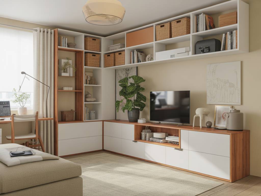
Build your neutral palette in layers
A warm neutral room isn’t one colour repeated everywhere. It’s a controlled layering of tones and textures, with very small but deliberate contrasts.
Layer 1: the base neutrals (70–80% of the room)
These are your walls, most of your larger furniture and possibly your curtains.
- Choose one main neutral (walls + some textiles).
- Add one supporting neutral for variety (a darker sofa, lighter rug, etc.).
Example for a living room:
- Walls: warm off-white with a touch of beige.
- Sofa: light greige fabric.
- Rug: creamy wool or wool-look.
- Curtains: same tone as the walls, one shade darker for depth.
Layer 2: the “temperature” materials
This is where the warmth really comes from.
- Wood: oak, walnut, ash in natural or slightly warm finishes.
- Textiles: linen, cotton, wool, bouclé, velvet in neutral shades.
- Natural fibres: jute, sisal, rattan, cane, seagrass.
- Stone: travertine, limestone, terrazzo with warm specks.
- Metals: brass, bronze, blackened steel (sparingly) for structure.
What matters is mixing textures so the eye reads “richness” rather than “flat beige mass”. For a typical living room, aim for at least:
- 2–3 different wood tones (but all warm or neutral in undertone)
- 2 main fabric textures (e.g. linen + wool) and 1 accent (e.g. bouclé)
- 1 natural fibre (jute rug, rattan chair, woven lampshade…)
Layer 3: accents and contrast, still neutral but bolder
To avoid everything blending into one blur, you need contrast. In a neutral palette, this often means deeper neutrals rather than bright colours.
Think:
- Charcoal or chocolate cushions and throws.
- Black or dark bronze lamp bases.
- Dark wood side table or console.
- Soft black window frames or door handles.
The goal is to “draw the lines” of the room. Without any dark anchors, a neutral room feels vague and unfinished.
Warm lighting: the non-negotiable
You can nail the palette and still end up with a cold atmosphere if your lighting is wrong. On renovation projects, I see the same errors over and over: only spots in the ceiling, bulbs that are far too white, and zero dimmers.
Choose the right colour temperature
For living areas (living room, bedroom, dining), aim for:
- Colour temperature: 2700–3000 K (warm white).
- CRI: 90+ if possible (better colour rendering).
Above 3000 K, you’re entering office/hospital territory. Your warm beige will look sad and grey.
Multiply light sources
Plan 3 types of lighting, at different heights:
- Ambient: ceiling lights, flush mounts, tracks (on dimmer).
- Task: reading lamps, desk lamps, under-cabinet kitchen lighting.
- Accent: wall sconces, small table lamps, picture lights.
In a standard 20–25 m² living room, you should end up with 5–7 individual light sources, not counting candles. That’s what makes the evenings feel warm and layered.
Budget & tips:
- Plan electrical points early in a renovation. Moving wires later is what blows the budget.
- Add at least one switched outlet per room for a floor or table lamp.
- Dimmers cost more upfront but save you from “interrogation room” lighting.
How to avoid a bland, “rental beige” look
“I went neutral and now my living room looks like a staging project for a real estate ad.” If that’s your fear, good news: it’s solvable.
Add subtle colour within the neutral range
Neutral doesn’t mean colour-free. You can stretch the palette with muted tones that keep the calm feeling:
- Terracotta, clay, cinnamon
- Muted olive or sage greens
- Dusty blush, nude, sand pinks
- Ink blue in small doses
Keep them in small surfaces first:
- Cushions, throws, art, pottery
- A painted alcove or the inside of a bookcase
- A single accent chair or headboard
Work with pattern and structure, not just solids
A room where everything is plain fabric will always look a bit “hotel”. Introduce discreet pattern:
- Herringbone or chevron parquet.
- Subtle stripes on cushions or bed linen.
- Woven caning, rattan weave, basketry.
- Light geometric pattern on a rug.
Stay within the palette (tone-on-tone) so pattern adds depth, not visual noise.
Bring in life: books, plants, and objects you actually use
The fastest way to warm up a neutral interior is to let it look lived in:
- A stack of books on the coffee table instead of three anonymous decor objects.
- 2–3 plants in real and terracotta pots (yes, the pot colour matters in a neutral room).
- Throws casually available (but not all piled on the same armchair).
Keep the “showroom” pieces to a minimum and prioritise objects with function and a bit of history.
Room-by-room examples and priorities
Living room: where to invest, where to save
Key pieces for warmth:
- Sofa: go for a warm neutral fabric (greige, oatmeal, light taupe). Avoid very cold greys.
- Rug: choose a size that anchors all main seating; material in wool, wool blend or a good synthetic with visible texture.
- Curtains: floor-length, lined if possible, in a textured fabric.
Where to invest:
- Sofa structure & fabric (you’ll live with it for years).
- Rug size and quality (cheap tiny rug = cheap look).
- 1–2 good lamps with warm light.
Where you can save / DIY:
- Cushions: mix covers from mid-range brands and even some DIY from upholstery fabric offcuts.
- Coffee table: a simple wooden or second-hand piece can be sanded and oiled to fit the palette.
- Decor: ceramics from flea markets, framed art prints instead of originals.
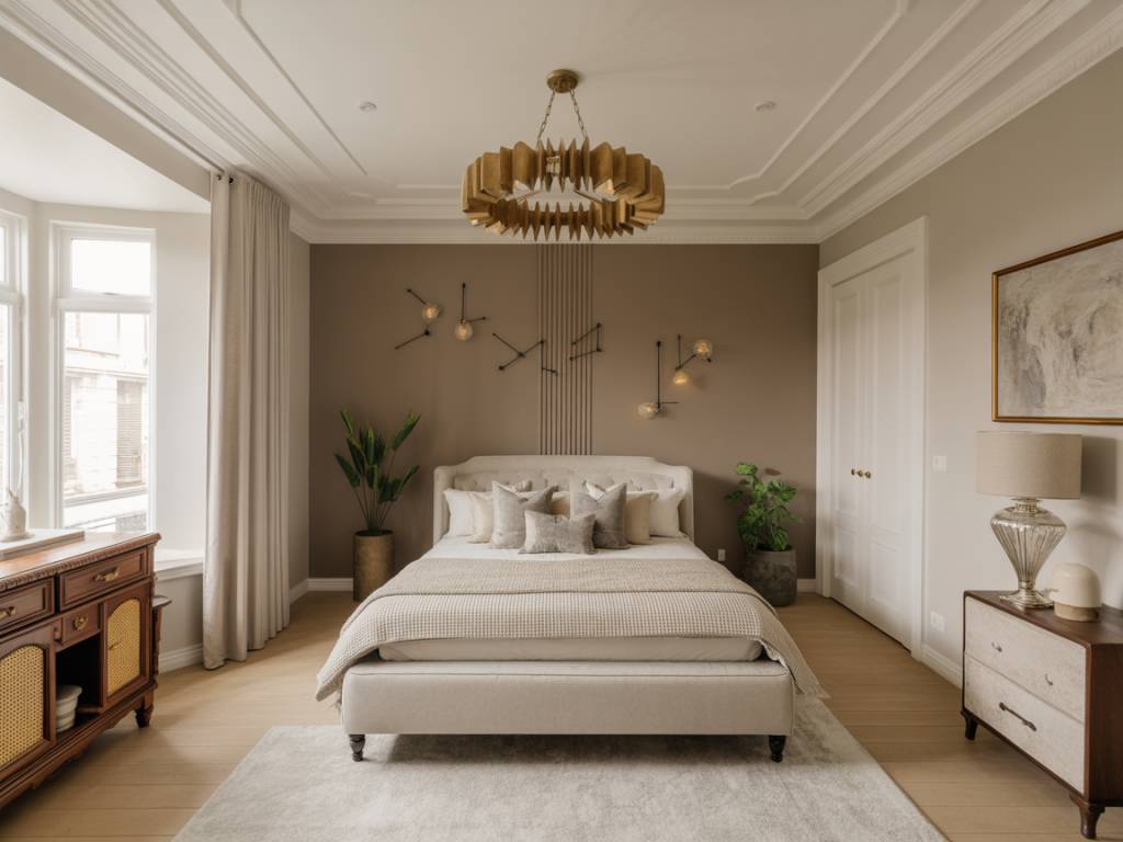
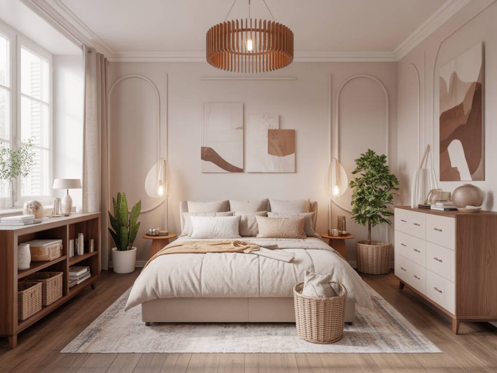
Bedroom: neutral without becoming boring
Base:
- Walls in a soft greige, beige, or very warm white.
- Textiles in layers: cotton percale + wool / knit throw + 3–4 cushions max.
To add warmth:
- Upholstered headboard in a textured neutral (linen, bouclé, chenille).
- Bedside lamps with fabric shades and warm bulbs.
- Timber bedside tables or wall shelves.
Watch out for: too much grey; if your floor is cool and your bed linen is grey, add wood, beige, and warm metal (brass reading lights, for example).
Kitchen: neutral but not clinical
Kitchens often go wrong because everything is flat: white cabinets, white backsplash, cold LED, and that’s it.
How to warm it up:
- Choose warm white or light beige for cabinets instead of optic white.
- Add wood: worktop, open shelves, or at least wooden accessories.
- Backsplash in warm stone, zellige-style tiles, or light-coloured terrazzo.
- Wall paint in a slightly warmer neutral than the cabinets.
Lighting:
- Under-cabinet lights at 2700–3000 K for worktop.
- One decorative pendant over the island or table with a warm filament-style LED.
Common mistakes (and how to fix them)
Mistake 1: “Everything is white and it feels like a lab”
Symptoms: white walls, white sofa, white curtains, few textures, harsh lighting.
Fix:
- Add one medium neutral: beige or greige for textiles (rug, cushions, throws).
- Introduce wood (side table, console, chair, frames).
- Switch bulbs to 2700–3000 K and add at least 2–3 lamps.
Mistake 2: “Too many greys, it looks sad”
Symptoms: grey floor, grey sofa, grey curtains, grey rug.
Fix:
- Add warm neutrals: camel, beige, off-white, sand.
- Swap or layer textiles: beige throws, off-white cushions, warm-toned wooden pieces.
- Introduce some greenery and natural fibres (jute, rattan).
Mistake 3: “Neutral, but visually too busy”
Symptoms: many small objects, mixed decor styles, no clear base colour.
Fix:
- Identify a dominant neutral and remove what doesn’t fit (especially very cool or very yellow items).
- Group decor by threes and by material (3 ceramics together, 3 books, etc.).
- Free up surfaces; empty 30% of your shelves and keep them that way.
If you’re starting from scratch: a simple action plan
For a standard 20 m² living room you want to refresh in a warm neutral palette, you can follow this roadmap.
- Step 1 – Diagnose (0 €): Note orientation, existing floor colour, and natural light. Take photos at different times of day.
- Step 2 – Choose your main neutral (30–80 €): Buy testers for 3–5 shades, paint patches, observe for 48 hours, pick one.
- Step 3 – Paint walls & ceiling (200–600 € DIY / more with pro): Aim for warm off-white, beige, or light greige, ceiling slightly lighter.
- Step 4 – Anchor with rug and curtains (300–1000 € depending on quality): Big enough rug, textured fabric curtains in a warm neutral.
- Step 5 – Evaluate sofa and big furniture (0–2000+ €): Keep and dress with throws if they work with the palette, or reupholster/replace when budget allows.
- Step 6 – Lighting (200–800 €): Warm LED bulbs, 1 ceiling point on dimmer + 2–3 lamps minimum.
- Step 7 – Textures & accents (100–400 €): Cushions in different neutrals, wool throw, wood elements, 1–2 darker anchors.
If that feels like a lot, stretch the project over a few months. Start with walls and bulbs; those two alone already change the perceived warmth of the room.
Neutral palettes aren’t the easy way out; they’re a deliberate construction. Test, compare, adjust, and don’t trust a paint chip held under the neon light of a DIY store. Your home deserves at least a proper mock-up on its own walls.